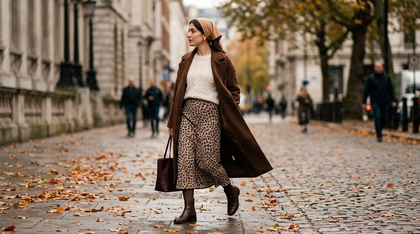
Fall 2026 Leopard Print Trend: How to Wear It Modestly Without Looking Loud
Why This Season’s Leopard Behaves Differently
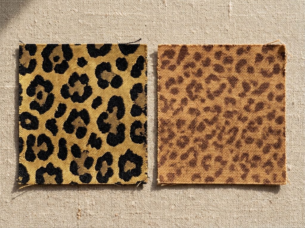
The card: Autumn 2026’s version of the print is softer, browner and smaller than the high-contrast leopard most people picture — and that shift is what makes it wearable on covered silhouettes.
The leopard print that dominated previous revivals was a graphic one: strong black rosettes on a bright tan or acid ground, high contrast, large repeat, designed to be seen across a room. What has settled in for this autumn is quieter. Warmer base tones, softer edges to the rosettes, more brown-on-brown and taupe-on-cream, and in a lot of cases a smaller repeat than the classic.
That matters more for a modest wardrobe than for any other, because low contrast is what turns pattern into texture. Hold two swatches at arm’s length. The high-contrast one still reads as spots. The tonal one starts to read the way tweed or a marled knit reads — surface interest, not a statement.
Which is the whole trick. You are not trying to wear less leopard. You are trying to wear leopard that the eye processes as fabric.
An Illustrative Case Study: One Wardrobe, One Season
The card: What follows is a composite scenario — not a real reported case — built to walk the problem through from the first bad purchase to a working autumn wardrobe.
To make the reasoning concrete rather than abstract, I have put it into a scenario. Call her Rana. She is thirty-one, works in a professional office, dresses in long sleeves and long hems year-round, and wanted to wear this trend without becoming the most visually eventful person in the meeting. Her situation is invented as a teaching device; the styling logic underneath it is not.
She made most of the standard mistakes first, which is useful, because they are the same ones I get asked about every autumn.
Phase One: The Coat That Wore Her
The card: She bought the boldest piece first — a full-length, high-contrast leopard coat — and it swallowed every outfit she put underneath it.
The coat was beautiful on the hanger. Big rosettes, strong black on tan, floor-skimming. On, it was a different object. Because the coat covered her from shoulder to ankle, the print was no longer an accent on an outfit — it was the outfit. Everything underneath became invisible. Every accessory became a competitor. Any bag that was not black or brown looked like a mistake.
She wore it three times and stopped.
Lesson pulled out of phase one: the more coverage a garment gives, the more print it delivers, and the effect is not linear — it compounds. A large-repeat print on a long coat is roughly the visual weight of a small-repeat print on four separate garments. If you dress in long lengths, treat any full-length printed piece as an entire outfit that you are then obliged to build around, not as a layer you throw over things.
There is a version of the printed coat that works, and it appears in phase four. It is not this one.
Phase Two: Learning to Read Scale and Contrast
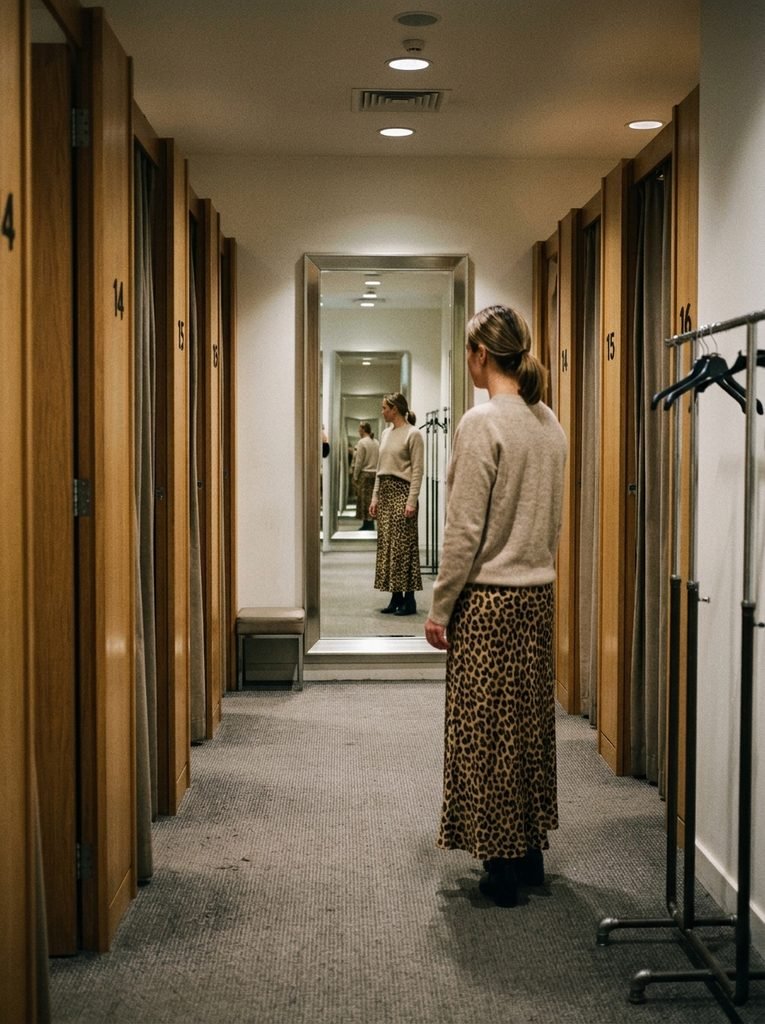
The card: The fix was not “less leopard” — it was smaller rosettes and less distance between the print’s lightest and darkest tone.
This is the part almost every guide skips, so it is worth being precise. Two variables decide how loud a leopard print looks, and neither of them is how much you like the print.
Scale is the size of the repeat. Rosettes the size of a coin behave completely differently from rosettes the size of a fist. On a long garment, a large repeat gives you very few, very visible shapes — which is why it announces itself. A small repeat gives you hundreds of small shapes, and at conversational distance they blur into a warm, mottled surface.
Contrast is the distance between the lightest and darkest tone in the print. Black on pale gold is maximum contrast. Chocolate on caramel is low. Low contrast is the single most forgiving thing you can choose, and it is very widely available this season.
Rana’s test became a practical one, and you can copy it in any fitting room: hold the garment up, step back three metres, and look at it in the mirror. If you still see individual spots, the print will dominate a long silhouette. If it has softened into texture, it will sit inside an outfit instead of taking it over. Photograph it on your phone and shrink the image if the mirror is not far enough away — the effect is the same.
Lesson pulled out of phase two: choose small scale and low contrast, in that order of priority. A modest wardrobe can carry far more leopard than people assume, as long as the print is quiet at distance.
Phase Three: Building the Neutral Frame
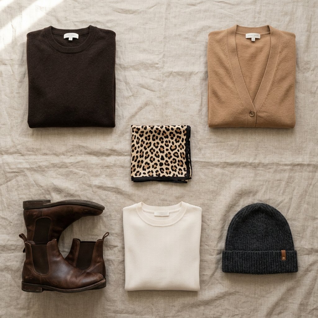
The card: One printed piece, everything else flat — and the flat colours pulled directly out of the print itself.
Once the print was chosen correctly, the rest of the outfit had one job: give the eye somewhere to rest.
The most reliable method is to take your neutrals from inside the print. Look closely at a leopard swatch and you will usually find three tones — a pale ground, a mid caramel or tan, and a dark brown or near-black outline. Any of those three, worn flat and undecorated, will look deliberate next to it. Chocolate brown is the strongest of them and badly underused. Ivory and bone read expensive. Charcoal is safe. Deep olive and burgundy sit slightly outside the print but work because they share its warmth.
Black is the most common choice and the least interesting one. It works, but it flattens everything and pushes the print’s contrast up rather than down, which is the opposite of what you want.
The rule Rana settled on: one printed garment, two flat neutrals, nothing else patterned. No striped scarf, no printed bag lining showing, no second animal texture. A modest outfit already has more visible fabric than a short one, so it reaches visual capacity faster.
Lesson pulled out of phase three: with high coverage, the neutrals are not the background — they are most of the outfit. Choose them as carefully as you chose the print.
Phase Four: The Four Placements That Actually Work
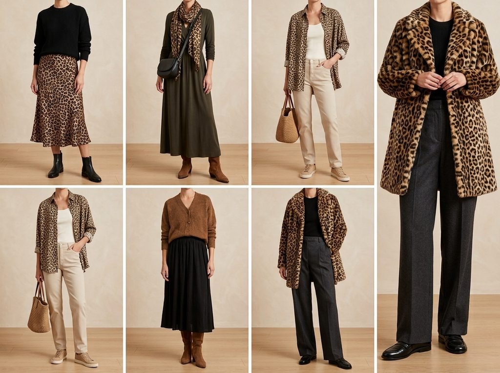
The card: Where the print sits changes how loud it is, and four placements suit covered silhouettes better than the rest.
Not all leopard pieces behave equally on a long, covered frame. These four are the ones worth the money.
The midi or maxi skirt. The strongest option and the one to buy first. The print sits below the waist, away from the face, and a flowing lower half absorbs a large-repeat print better than a fitted one. Pair with a plain knit in a tone pulled from the print, long sleeves, and boots in the darkest tone available.
The scarf, worn as a headscarf or around the neck. Highest impact for the smallest surface area. Because it sits at the face it lifts a completely plain outfit — plain long-sleeved dress, plain coat — and does the styling work of a whole garment. Keep the scale small here; a large repeat close to the face is the loudest configuration in the entire wardrobe.
The relaxed shirt or overshirt, worn open. Print broken into two vertical strips down the front rather than one continuous field. That vertical break is genuinely flattering and quietly reduces how much print the eye takes in at once. Wear it over an ivory or chocolate base layer.
The short coat or blazer, not the full-length one. Here is the printed-coat redemption. Cut at the hip, in a small-scale tonal print, over a long plain dress or wide trousers, it works exactly as intended — a printed layer on a plain outfit. It is the full-length version that becomes the outfit.
Lesson pulled out of phase four: the further the print sits from the face and the more it is broken up, the more of it you can wear. Move it up towards the face and you need to shrink it.
Phase Five: The Accessories-Only Route
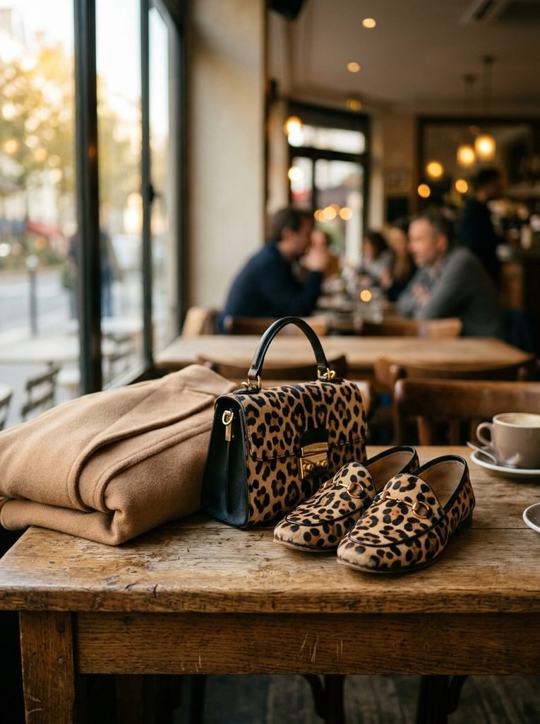
The card: If the print still feels like too much on the body, wear it entirely below the ankle and on the arm.
There is a completely legitimate version of this trend in which you own no printed clothing at all.
Leopard flats, loafers or ankle boots. A small leopard bag. A leopard-trimmed glove or a belt. Any one of these, worn with a monochrome column of chocolate, camel or ivory, delivers the trend at full strength and cannot go wrong, because the surface area is too small to overwhelm anything.
This is also the cheapest entry point and the most durable. Leopard-print shoes and bags have outlasted every revival cycle of the last forty years — they behave like neutrals, and they will still make sense two autumns from now when the clothing version has moved on. If you are buying one leopard thing in your life, buy the shoes.
Lesson pulled out of phase five: accessories give you the trend with none of the coverage problem. Start here if you are unsure.
Phase Six: Adapting It Across Climates and Dress Codes
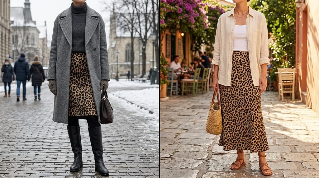
The card: The same styling logic holds worldwide — what changes is the fabric weight and how far the print is allowed towards the face.
Autumn is not one thing. Readers in northern Europe, Canada or the northern United States are dressing for cold; readers in the Gulf, South Asia, North Africa, Australia or Southeast Asia are dressing for warmth in the same months, in the same trend.
Cold-climate autumn. Wool, boiled wool, brushed twill, faux shearling. The printed midi skirt over opaque tights and tall boots. The short printed coat over a heavy knit. Layering gives you more garments, so hold the line harder on “only one of them is printed”.
Warm-climate autumn. Viscose, crepe, lightweight twill, cotton lawn. The printed maxi skirt in a fluid fabric moves beautifully and stays cool. A printed lightweight overshirt does the layering job without the heat. Avoid heavy synthetic satin in leopard, which reads cheap in bright natural light in a way it does not under grey skies.
Conservative professional and formal settings. Push contrast as low as it goes — chocolate on caramel, taupe on cream — and keep the print below the waist or confined to accessories. A tonal leopard skirt with an ivory knit and a camel coat is unobjectionable in almost any office on earth.
Cultural context. In markets where animal print carries a slightly showy association, the tonal small-scale version sidesteps it entirely, because most people will not register it as leopard until they are close. That is a feature, not a compromise.
Lesson pulled out of phase six: the trend translates globally without modification. Only the fabric weight and the print’s distance from your face need adjusting.
Phase Seven: What Went Wrong, and What Fixed It
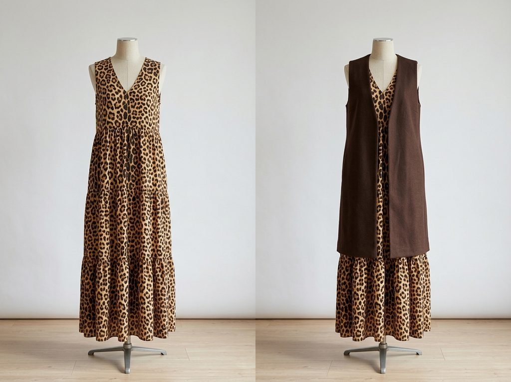
The card: Six errors accounted for nearly every outfit that failed — and each has a one-line correction.
Collected from the whole scenario, plus the questions readers send in every year:
- Two prints at once. Even leopard with a subtle stripe is too much across a covered silhouette. One print, always.
- Print at the face and at the hem simultaneously. The eye ping-pongs. Choose one end.
- Shiny fabric in a large repeat. Sheen amplifies scale. Matte fabrics carry big prints far better.
- Bright accent colours. Red, fuchsia and cobalt fight the print. Keep accents inside the print’s own tonal family.
- Gold hardware everywhere. Leopard is already warm and busy. Restrained hardware in brushed gold or dark metal is enough.
- A fully printed dress with no break. The most common single mistake in modest styling. If you own one, add a plain long cardigan, coat or waistcoat over it — the vertical break alone rescues it.
Lesson pulled out of phase seven: every failure is a volume problem, not a taste problem. Reduce the volume and the same pieces start working.
Phase Eight: Buying and Keeping It
The card: Spend on the piece you will re-wear for years; economise on the one that belongs to this season only.
Where the money goes matters, because animal print splits cleanly into two categories.
Long-term pieces — leopard shoes, a small leopard bag, a good tonal scarf, a well-cut short printed coat. These recur every few years and never look dated in the meantime. Buy properly.
Season-specific pieces — anything in this year’s exact colourway, anything very large in scale, anything trend-shaped. Spend less; enjoy them now.
On care: printed fabrics fade unevenly, and a faded leopard loses contrast in the wrong direction — the ground yellows while the rosettes stay dark. Wash cool, dry away from direct sun, and store printed knits folded rather than hung. For faux-fur leopard, brush the pile in one direction after wearing; matted patches distort the print far more visibly than they do on plain fur.
For anyone curious about how far back this print goes in fashion history — considerably further than most people assume, and through several distinct cycles of meaning — museum costume collections are the honest source, and many publish their archives online.
Also Read: How to Start a Clothing Brand: A Global Launch Blueprint
Key Takeaways
- Coverage multiplies print. A long, modest silhouette shows several times more fabric than a short one, so scale and contrast must come down to compensate.
- Choose small rosettes and low contrast first. Chocolate-on-caramel and taupe-on-cream read as texture, not pattern.
- One printed garment per outfit. Everything else flat, in a neutral pulled from inside the print itself.
- The best placements for covered wardrobes: midi/maxi skirt, scarf, open overshirt, hip-length coat. Avoid the full-length high-contrast coat.
- Accessories-only is a complete, valid version of the trend and the most durable investment.
- The three-metre mirror test settles any purchase: if you can still count the spots from across the room, it will dominate a long outfit.
The bottom line: the Fall 2026 leopard print trend is unusually friendly to modest dressing this season, because the print itself has gone softer, smaller and browner. Get the scale and contrast right and you can wear far more of it than the standard advice suggests. Get them wrong and no amount of careful styling underneath will save the outfit.
FAQ
Is leopard print still in style for autumn 2026?
Yes, and it has been in continuous rotation for several seasons rather than appearing as a single spike. What has changed is the character of it — warmer, browner, lower-contrast and often smaller in scale than the graphic black-on-gold version. That shift is what has kept it in circulation instead of burning out.
Can leopard print ever look elegant rather than loud?
Reliably, yes. Elegance here is a function of scale, contrast and restraint, not of the motif. A small tonal print on one garment, framed by flat neutrals, reads as considered. The same motif in a large high-contrast repeat across several garments is what people mean when they call it loud.
What colours go with leopard print?
Take them from the print itself: chocolate brown, caramel, camel, ivory and bone. Charcoal and deep olive work as well. Burgundy is the one genuinely interesting non-neutral pairing. Bright saturated colours compete and are best avoided next to any large area of animal print.
How do I wear leopard print with a hijab or headscarf?
Two clean options. Wear a small-scale tonal leopard scarf with a completely plain outfit, letting the scarf carry the whole look. Or wear a plain scarf in a neutral drawn from the print and put the leopard lower down — a skirt, shoes or a bag. Print at the face and print at the hem at the same time is the one combination to skip.
Will leopard print date quickly?
Clothing in a very specific seasonal colourway will date the way any trend piece does. Leopard-print shoes and bags will not — they have functioned as quasi-neutrals across decades and multiple revivals. Weight your spending accordingly.
Can I wear leopard print to a conservative office?
In most cases, yes, if you keep contrast low and placement low. A tonal leopard midi skirt with an ivory knit and a camel coat is quiet enough for the great majority of professional environments. Loafers or a small bag are quieter still.